For the First Time in 23 years, BMW Rebrands with a New Flat BMW Logo
The logo made its debut on the Concept i4
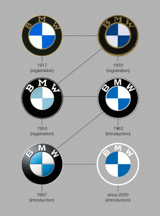
BMW, a brand that has survived and impressed people for more than a hundred years, is up for some serious changes. It has redesigned its logo only the fifth time since it was introduced in 1917. Yes, the famous roundel has changed a lot as the brand unveiled a new BMW logo recently. Here’s everything you need to know about it.
The basic architecture and the circular shape of the logo are still the same, and the middle of the new BMW logo also has the blue and white colours of the Bavarian state from where the brand hails. Some people assume that the blue and white is a spinning propeller that’s meant to honour the aircraft engine beginnings of the brand, the PR department and the BMW historians agree that the blue and white colours are added as a tribute to Bavaria.
One thing that has impressed people about the new BMW logo is the new retro font which spells out the name of the brand. Also, the outer circle is not black but clear. As a result, the new badge will have a different appearance depending on what colour of car it is on. For instance, if it is on a black car, it will look almost the same as the classic badge. But still, the font will make the logo look appear differently. Some people also like the fact that the new BMW logo has modernized the emblem while acknowledging the long history of the brand at the same time.
The automaker released a lengthy explainer regarding the new BMW logo. In the document explaining the reasoning behind the new logo, revealed a new identity for the automaker, saying that, “BMW is becoming a relationship brand.” The company hopes that the new logo will ““radiate more openness and clarity” and “invite our customers more than ever to become part of the BMW world.”
The new BMW logo has already appeared on the nose of Concept i4, but it might not be used on the production cars. It is not the first time that a German carmaker has changed its logo. Volkswagen also changed its iconic logo in September 2019 with minimalistic recreation. Many people think that BMW did a better job of it.